Lessons Learned from Analyzing Competitive Pokemon
06 Sep 2018Competitive Pokemon is a turn-by-turn multiplayer game where you build a team of 6 Pokemon to battle other players. It differs from the traditional Pokemon games in that you don’t have to catch or train the pokemon: you can simply choose them. Pokemon are split into tiers based on their usage by players (in general, stronger Pokemon are in higher tiers). When you play in a certain tier, you can use pokemon in that tier or lower.
Since these tiers are determined by how much Pokemon are used by competitive players (i.e. tiers are constantly changing), I thought it would be an interesting task to try to predict a Pokemon’s tier based on its in-game characteristics. So, I scraped data from Smogon, Bulbapedia, and Veekun using BeautifulSoup for Python. I then cleaned and analyzed various properties about pokemon with respect to their tiers in a Jupyter Notebook. Finally, I built a regression model using Scikit-learn. You can see my work here. Below are the lessons I learned along the way about data analysis, visualization, and modelling.
Data Analysis
Focus more on causes than outcomes
It’s easy to create visualizations and understand the data on the surface level, but I found it far more insightful to think about causes at every step. For example, below is a visualization of the distribution of types by tier.
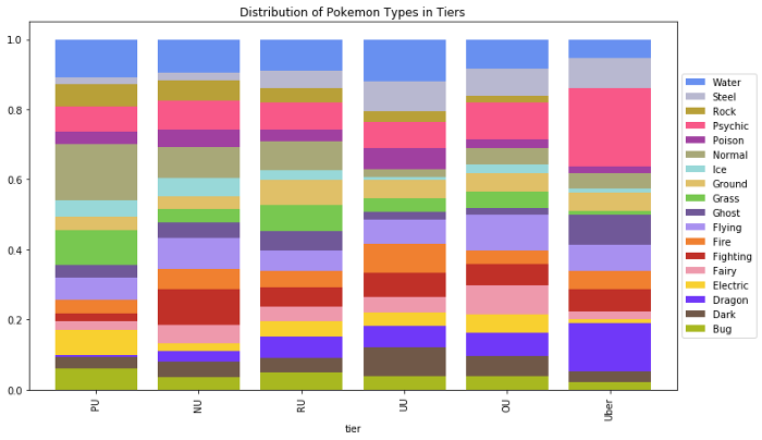
At face value, it seems like psychic and dragon types are stronger while normal types are weaker. This is not immediately obvious given the strengths and weaknesses of each type. Looking at the actual Pokemon in these tiers, it turns out that the creators of Pokemon simply made more dragon and psychic type legendaries, while they normal type Pokemon tended to have an lower base stat total. So, it wasn’t the type that made this difference, but rather other properties about Pokemon of this type. Without looking into this, I would have assumed type was important, whereas in reality, there are other factors.
Assume nothing about data reliability
When I started analyzing the moves of the Pokemon, there were a few issues, such as missing moves, invalid moves, and some extra apostrophes in move names. I was able to solve the latter two; however, I could only slightly mitigate the first issue by identifying a few “exclusive” moves and adding them manually (the data source I was using was unreliable).
I noticed these by looking closely at the actual data after creating charts to see if the chart results made sense. In particular, after visualizing how many Pokemon learn each move, I double checked the top and bottom 20 most common moves. The most common moves included unlearnable moves like “Struggle” among others that I could remove. I found it was important to not only look at what’s there, but also think about what should be there. For the least common moves, I expected to see some exclusive moves that I did not, which lead me to find the missing moves.
Analyze and understand anomalies
After much of the analysis, I found that a Pokemon’s base stat total (BST) had the strongest correlation with their tier. So, I found the mean and standard deviation of Pokemon BSTs by tier. Then, I looked at the 14 Pokemon whose BST was greater than two standard deviations away from the tier mean. For this project, anomaly analysis was by far the most useful exercise for understanding the data and creating features. In addition to creating features, I was able to reduce the feature space overall by consolidating certain moves and abilities.
Data Visualization
Boxplots are amazing…but not for everything
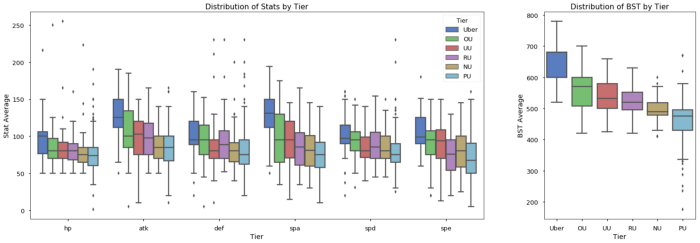
Boxplots are used to show the distribution of data by category. The box shows the interquartile range (25th percentile to 75th percentile), the line in the box shows the median, and the points above and below the whiskers show outliers. The top whisker represents the largest data point within 1.5 times the interquartile ranges of the box, similarly the bottom whisker shows the smallest data point within 1.5 interquartile ranges of the box. I find them more useful than violinplots or boxenplots because boxplots show useful statistical information (interquartile, median, etc.). Below is a chart showing the distributions of various stats by tier on the left, and the distribution of the BST by tier on the right.
I liked these plots a little too much and started using them in places where they should not have been used, such as the plot below, showing the distribution of exclusive moves.
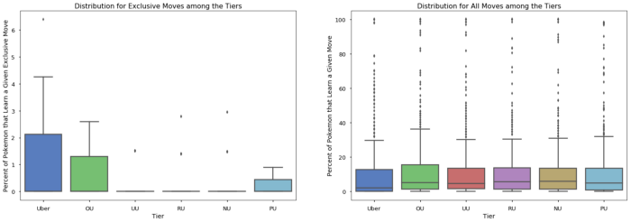
Since I knew the variance was so high relative to the median, I should have used a point plot instead. Another example is when I visualized the distribution of forms among the tiers:
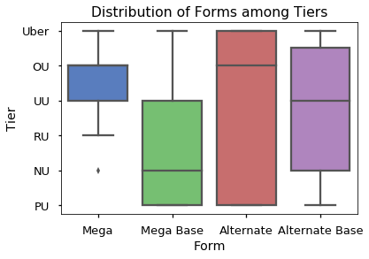
A boxplot makes sense when you are measuring a continuous value. In the chart above, we are looking at a discrete variable with a few levels, so a heatmap would have worked a lot better.
In general, boxplots are useful for data that is continuous and “normal-ish” in distribution. Boxplots are not useful when the variance of the data is greater than the mean. Finally, while boxplots are useful for exploration, they are less useful when communicating your findings to others, particularly non-technical folks. When you are trying to show trends, it may be more useful to use a simple pointplot. Boxplots tend to obscure trends and similar results because they show a lot of auxiliary information.
Avoid pie charts for comparing proportions
After working with this dataset and reading articles online, I found pie charts were not useful for comparing proportions. Below is a pie chart I used to see the distribution of Pokemon among the tiers:
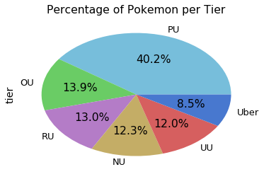
The chart does a good job of showing that PU is a lot bigger, but your eyes can’t really tell the difference between the other tiers without the percentages.
I almost always prefer a stacked bar chart, such as the one I used to show the distribution of types earlier in this article. Below is another example where I compare the distribution of forms by tier:
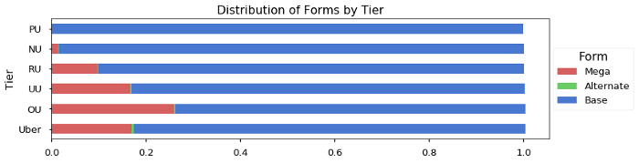
This chart makes the relationship between the forms and the tiers very clear. There’s more information on why you should avoid pie charts in this great article.
Visualizing for exploration vs. explanation
I touched on this idea briefly when talking about boxplots. Many visualizations give too much information which can obscure your main message. The extra information is key for data exploration, but can get in the way when you try to explain your data to others. For example, below is a visualization of how the moves are distributed by tier. Each row represents a move, and the darkness of the box shows what percentage of Pokemon within that tier learn that move. The moves are ordered by most common to least common.
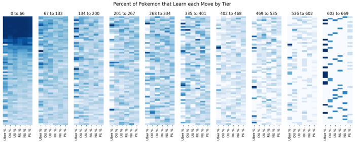
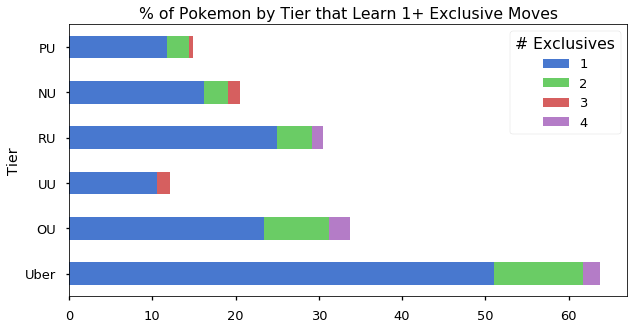
This graphic gave me a general intuition about how common and rare moves are distributed among tiers. In particular, I learned that the Uber tier hogs many moves, likely due to having a lot of legendary Pokemon. To the reader, however, this graphic does not show any clear message. To communicate this idea, I would use the below plot, showing the percentage of Pokemon that learn at least one exclusive move by tier:
Data Modelling
To predict a Pokemon’s tier is an ordinal classification task (i.e. your target variable is categorical with an order, such as Pokemon tiers), and so regression is the way to go. Below are a couple of brief tips I learned about ordinal classification. As a disclaimer, the lessons here are partly empirical and partly advice I heard from others.
Use a sigmoid on your output
If you are using an generalized linear model or a neural network, use a sigmoid activation on your output with a scalar multiplier. For example, if you have 6 levels (0 to 5), multiply your sigmoid by 5 so the range is 0 to 5. For Pokemon tiers specifically, no matter how strong a pokemon is, they can’t be in a higher tier than the highest tier (same idea for weak pokemon). A sigmoid essentially puts an upper and lower bound on your output, so your model can just output a very high (low) value for strong (weak) and the sigmoid will take care of truncating the result. This allows the model to focus on learning how to differentiate the tiers in the middle.
Use MAE over MSE (sometimes)
For this project, Mean Absolute Error (MAE) worked better than Mean Squared Error (MSE). Without getting into the math, MSE is used for continuous target variables because it penalizes values that are farther away from the actual value more than values that are close to the actual. Since ordinal classification is still classification, your model is either right or wrong. In this sense, we care more about how accurate the model is than how large the errors are when it is wrong (which MAE is better at than MSE). Also, when dealing with ordered categories (like tiers), there is no concrete notion of “distance” between various tiers, just order. So, how much “larger” one error is compared to another is completely dependent on the numbers used to label the ordered classes (which in this case are tiers numbered 0 to 5). MAE tends to yield better classification accuracy because it treats all errors equally as errors, whereas MSE emphasizes large errors.
When to use MSE vs MAE is summed up well by L. Gaudette and N. Japkowicz in Evaluation Methods for Ordinal Classification (2009):
Mean squared error is found to be the best metric when we prefer more (smaller) errors overall to reduce the number of large errors, while mean absolute error is also a good metric if we instead prefer fewer errors overall with more tolerance for large errors.
Ultimately, this problem ended up being unsuitable for machine learning. Essentially, the feature space was too large and the interactions between the features were too complex for a model to learn given the small training set. In other words, there are many examples of Pokemon that are in their particular tier because of some unique combination of their type, ability, moves, and stats that are quite different from other Pokemon in that tier. You can read an in depth breakdown of this in the full notebook.
I hope these takeaways are helpful, please let me know if you have any feedback or questions!
Note: This post was originally published on medium.com, then moved here on August 26th, 2020